Note
Go to the end to download the full example code
Replicate Mirchi et al., 2018, SCAN
This example demonstrates how to replicate the primary results from Mirchi et al., 2018, SCAN. It includes a brief introduction on how to perform / interpret a PLS analysis, and re-generates the first figure from the referenced manuscript.
First we’ll need to fetch the data. We can use the built-in dataset fetcher
for the Mirchi et al., 2018 paper; this will, by default, download the
relevant data and cache it in ~/nnt-data/ds-mirchi2018. If another directory
is preferred you can specify the path with the data_dir parameter.
from netneurotools.datasets import fetch_mirchi2018

X, Y = fetch_mirchi2018(data_dir=None, verbose=0)
print('MyConnectome sessions: {}'.format(len(X)),
      'Functional connectivity edges: {}'.format(X.shape[-1]),
      'PANAS sub-scores: {}'.format(len(Y.dtype)), sep='\n')
MyConnectome sessions: 73
Functional connectivity edges: 198135
PANAS sub-scores: 13
We see that we have 73 sessions of data from the MyConnectome project. The
X matrix represents functional correlations between regions of interest
and the``Y`` matrix represents PANAS subscore measures.
First, we’ll need to convert the Y matrix to a slightly more usable
format. It’s returned from the function as a structured numpy array where
each column has its own datatype (i.e., a different subscore measure). To
perform normal matrix operations on it we need it to be an standard
“unstructured” array. We’ll save the PANAS measure names before converting so
we can use them to plot things later!
Once we convert the Y matrix we need to z-score the data. This will
ensure that the results of our PLS decomposition can be interpreted as
correlations (rather than covariances), making deriving inferences from the
data much easier.
from numpy.lib.recfunctions import structured_to_unstructured
from scipy.stats import zscore

panas_measures = list(Y.dtype.fields)
Y = structured_to_unstructured(Y)
Xz = zscore(X, ddof=1)
Yz = zscore(Y, ddof=1)
Now that we’ve z-scored data we can run our PLS analyis.
First, we’ll construct a cross-correlation matrix from X and Y. This
matrix will represent the correlation between every functional connection and
PANAS subscore across all 73 sessions in the MyConnectome dataset.
We can decompose that matrix using an SVD to generate left and right singular
vectors (U and V) and a diagonal array of singular values (sval).
U shape: (198135, 13)
V shape: (13, 13)
The rows of U correspond to the functional connections from our X
matrix, while the rows of V correspond to the PANAS subscores from our
Y matrix. The columns of U and V, on the other hand, represent
new “dimensions” that have been found in the data.
The “dimensions” obtained with PLS are estimated such that they maximize the
correlation between the values of our X and Y matrices projected onto
these new dimensions. As such, a good sanity check is to examine the
correlation between these projected scores for all the components; if the
correlations are low then we should interpret the results of the PLS with
caution.
from scipy.stats import pearsonr

# Project samples to the derived space
x_scores, y_scores = Xz @ U, Yz @ V

for comp in range(x_scores.shape[-1]):
    # Correlate the sample scores for each component
    corr = pearsonr(x_scores[:, comp], y_scores[:, comp])
    print('Component {:>2}: r = {:.2f}, p = {:.3f}'.format(comp, *corr))
Component  0: r = 0.70, p = 0.000
Component  1: r = 0.69, p = 0.000
Component  2: r = 0.80, p = 0.000
Component  3: r = 0.86, p = 0.000
Component  4: r = 0.88, p = 0.000
Component  5: r = 0.90, p = 0.000
Component  6: r = 0.87, p = 0.000
Component  7: r = 0.79, p = 0.000
Component  8: r = 0.92, p = 0.000
Component  9: r = 0.88, p = 0.000
Component 10: r = 0.89, p = 0.000
Component 11: r = 0.86, p = 0.000
Component 12: r = 0.92, p = 0.000
Looks like the correlations are quite high for all the components! This isn’t entirely unexpected given that this is the primary goal of PLS.
To dig into things a bit more we can also calculate the correlation of the
original PANAS scores (from the Y matrix) with the values of our X
matrix projected to the PLS space (i.e., x_scores, from above). This will
give us an idea of which PANAS measures are most (or least) correlated with
the overall functional connnectivity estimates.
We can look at these correlations for the first component to get an idea of things.
import matplotlib.pyplot as plt

y_corr = (Yz.T @ zscore(x_scores, ddof=1)) / (len(x_scores) - 1)
for n, panas_correlation in enumerate(y_corr[:, 0]):
    print('PANAS subscore {:<14} r = {:>5.2f}'.format(panas_measures[n] + ':',
                                                      panas_correlation))

fig, ax = plt.subplots(1, 1)
ax.barh(range(len(y_corr))[::-1], width=y_corr[:, 0],)
ax.set(yticks=range(len(y_corr))[::-1], yticklabels=panas_measures)
ax.set(xlabel='Correlation with projected X scores')
fig.tight_layout()
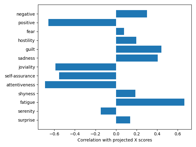
PANAS subscore negative:      r =  0.30
PANAS subscore positive:      r = -0.66
PANAS subscore fear:          r =  0.08
PANAS subscore hostility:     r =  0.20
PANAS subscore guilt:         r =  0.44
PANAS subscore sadness:       r =  0.40
PANAS subscore joviality:     r = -0.59
PANAS subscore self-assurance: r = -0.55
PANAS subscore attentiveness: r = -0.69
PANAS subscore shyness:       r =  0.19
PANAS subscore fatigue:       r =  0.67
PANAS subscore serenity:      r = -0.15
PANAS subscore surprise:      r =  0.14
This is great, but it would be nice to have some metrics to help determine how many components we should be considering. Thankfully, we can do that in a few different ways.
First, we can assess the effect size (or variance explained) explained by each component. This is simply the squared singular value for each component divided by the sum of all squared singular values. We’ll plot this to get an idea of how quickly it drops off.
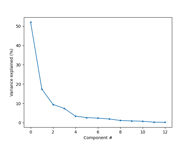
[Text(0.5, 23.52222222222222, 'Component #'), Text(47.097222222222214, 0.5, 'Variance explained (%)')]
We can also use permutation sampling to perform null-hypothesis significance testing in order to examine the extent to which the variance explained by each component is greater than would be expected by chance.
Here, we’ll permute one of our matrices (i.e., the Y matrix), re-generate
the cross-correlation matrix, and derive a new SVD space. To ensure the
dimensions we estimate are the “same” as the original SVD, we’ll use an
orthogonal Procrustes rotation to align them, and then calculate the variance
explained by each of the “permuted” dimensions derived from the permuted
data. If we do this enough times we can generate a distribution of explained
variances for each component and use that to examine the relative likelihood
of our original components explaining as much variance as they do.
import numpy as np

n_perm = 100
rs = np.random.RandomState(1234)  # Set a random seed for reproducibility

sval_perm = np.zeros((len(varexp), n_perm))

for n in range(n_perm):

    # Permute and z-score the Y matrix (leaving the X matrix intact)
    resamp = rs.permutation(len(Y))
    Ypz = zscore(Y[resamp], ddof=1)

    # Regenerate the cross-correlation matrix and compute the decomposition
    cross_corr = (Ypz.T @ Xz) / (len(Xz) - 1)
    U_new, sval_new, V_new = svd(cross_corr.T, full_matrices=False)
    V_new = V_new.T

    # Align the new singular vectors to the original using Procrustes. We can
    # do this with EITHER the left or right singular vectors; we'll use the
    # left vectors since they're much smaller in size so this is more
    # computationally efficient.
    N, _, P = svd(V.T @ V_new, full_matrices=False)
    aligned = V_new @ np.diag(sval_new) @ (P.T @ N.T)

    # Calculate the singular values for the rotated, permuted component space
    sval_perm[:, n] = np.sqrt(np.sum(aligned ** 2, axis=0))

# Calculate the number of permuted singular values larger than the original
# and normalize by the number of permutations. We can treat this value as a
# non-parametric p-value.
sprob = (np.sum(sval_perm > sval[:, None], axis=1) + 1) / (n_perm + 1)
for n, pval in enumerate(sprob):
    print('Component {}: non-parametric p = {:.3f}'.format(n, pval))
Component 0: non-parametric p = 0.010
Component 1: non-parametric p = 0.079
Component 2: non-parametric p = 0.287
Component 3: non-parametric p = 0.762
Component 4: non-parametric p = 0.495
Component 5: non-parametric p = 0.762
Component 6: non-parametric p = 0.426
Component 7: non-parametric p = 0.475
Component 8: non-parametric p = 0.901
Component 9: non-parametric p = 0.832
Component 10: non-parametric p = 0.881
Component 11: non-parametric p = 0.861
Component 12: non-parametric p = 0.990
We can see that only the first component is “significant” with an alpha of 5% (i.e., _p_ < 0.05). This component also explained the majority of variance in the data (>50%), so it seems like something we might want to investigate more.
In order to begin to try and interpret the relationships between functional connectivity and PANAS scores for that component it would be great to have an estimate of the reliability of the component. This would give us an idea of which functional connections / PANAS subscores are potentially “driving” i.e., contributing the most to) the PLS component.
We can try and estimate this reliability using bootstrap resampling. Since
there are so many functional connections (>16,000), we’ll aim to generate a
“bootstrap ratio” for each connection. This “bootstrap ratio” (or BSR) will
be calculate by dividing the original component weights in the left singular
vectors (the U matrix) with the standard error of the component weights
estimated by bootstrap resampling the original data. These BSRs can be used
as a sort of “z-score” proxy (assuming they’re normally distributed), giving
us an idea of which functional connections most strongly contribute to the
PLS dimensions estimated from our data.
On the other hand, since there are so few PANAS scores (only 13!), we can
use bootstrap resampling to generate actual confidence intervals (rather than
having to use bootstrap ratios as a proxy). These confidence intervals will
give us an idea of the PANAS subscores most consistently related to the
functional connections in our X matrix.
Estimating these bootstrapped distributions is much more computationally intensive than estimating permutations, so we’re only going to do 50 (though using a higher number would be better!).
n_boot = 50

# It's too memory-intensive to hold all the bootstrapped functional connection
# weights at once, especially if we're using a lot of bootstraps. Since we just
# want to calculate the standard error of this distribution we can keep
# estimates of the sum and the squared sum of the bootstrapped weights and
# generate the standard error from those.
U_sum = U @ np.diag(sval)
U_square = (U @ np.diag(sval)) ** 2

# We CAN store all the bootstrapped PANAS score correlations in memory, and
# need to in order to correctly estimate the confidence intervals!
y_corr_distrib = np.zeros((*V.shape, n_boot))

for n in range(n_boot):

    # Bootstrap resample and z-score BOTH X and Y matrices. Also convert NaN
    # values to 0 (in the event that resampling generates a column with
    # a standard deviation of 0).
    bootsamp = rs.choice(len(X), size=len(X), replace=True)
    Xb, Yb = X[bootsamp], Y[bootsamp]
    # Suppress invalid value in true_divide warnings (we're converting NaNs so
    # there's no point in getting annoying warnings about it).
    with np.errstate(invalid='ignore'):
        Xbz = np.nan_to_num(zscore(Xb, ddof=1))
        Ybz = np.nan_to_num(zscore(Yb, ddof=1))

    # Regenerate the cross-correlation matrix and compute the decomposition
    cross_corr = (Ybz.T @ Xbz) / (len(Xbz) - 1)
    U_new, sval_new, V_new = svd(cross_corr.T, full_matrices=False)

    # Align the left singular vectors to the original decomposition using
    # a Procrustes and store the sum / sum of squares for bootstrap ratio
    # calculation later
    N, _, P = svd(U.T @ U_new, full_matrices=False)
    aligned = U_new @ np.diag(sval_new) @ (P.T @ N.T)
    U_sum += aligned
    U_square += np.square(aligned)

    # Delete intermediate variables to reduce memory usage
    del cross_corr, U_new, sval_new, V_new, aligned

    # For the right singular vectors we actually want to calculate the
    # bootstrapped distribution of the CORRELATIONS between the original PANAS
    # scores and the projected X scores (like we estimated above!)
    #
    # We project the bootstrapped X matrix to the original component space and
    # then generate the cross-correlation matrix of the bootstrapped PANAS
    # scores with those projections
    Xbzs = zscore(Xb @ (U / np.linalg.norm(U, axis=0, keepdims=True)), ddof=1)
    y_corr_distrib[..., n] = (Ybz.T @ Xbzs) / (len(Xbzs) - 1)

    # Delete intermediate variables to reduce memory usage
    del Xbz, Ybz, Xbzs

# Calculate the standard error of the bootstrapped functional connection
# weights and generate bootstrap ratios from these values.
U_sum2 = (U_sum ** 2) / (n_boot + 1)
U_se = np.sqrt(np.abs(U_square - U_sum2) / (n_boot))
bootstrap_ratios = (U @ np.diag(sval)) / U_se

# Calculate the lower/upper confidence intervals of the bootrapped PANAS scores
y_corr_ll, y_corr_ul = np.percentile(y_corr_distrib, [2.5, 97.5], axis=-1)
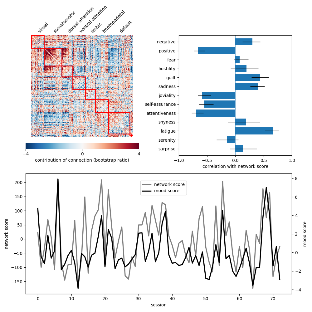
Now we can use these results to re-generate the entirety of Fig 1 from Mirchi et al., 2018!
# Community assignments for the MyConnectome dataset are stored online. We'll
# fetch and load those into an array so we can plot the bootstrap ratios sorted
# by communities.

from urllib.request import urlopen

comm_url = "http://web.stanford.edu/group/poldracklab/myconnectome-data/base" \
           "/parcellation/parcel_data.txt"
comm = np.loadtxt(urlopen(comm_url).readlines(), delimiter='\t', dtype=str)

# The ninth column of this array specifies the Yeo 7-network affiliation of the
# nodes with e.g., "7Network_1," "7Network_2." We'd prefer to just have a
# numerical vector specifying network assignments, so we convert it here. We'll
# also list the actual Yeo networks, as well, so that we can plot them.

# the last two "communities" are the Freesurfer medial wall and subcortex
comm_labels = [
    'visual', 'somatomotor', 'dorsal attention', 'ventral attention',
    'limbic', 'frontoparietal', 'default', '', ''
]
comm_ids = np.unique(comm[:, 8], return_inverse=True)[-1]

# Now we can actually plot things! First, make a little grid of plots to
# approximately match the layout from Figure 1.

from matplotlib.gridspec import GridSpec

fig = plt.figure(figsize=(10, 10))
gs = GridSpec(2, 2, figure=fig)
ax1 = plt.subplot(gs[0, 0])
ax2 = plt.subplot(gs[0, 1])
ax3 = plt.subplot(gs[1, :])

# Convert the bootstrap ratios into a node x node matrix of functional weights
# and plot them, sorting by community assignment. This will give us an idea of
# which communities / networks are contributing most.

from netneurotools.plotting import plot_mod_heatmap

bsr_mat = np.zeros((630, 630))
bsr_mat[np.tril_indices_from(bsr_mat, k=-1)] = bootstrap_ratios[:, 0]
bsr_mat = bsr_mat + bsr_mat.T

plot_mod_heatmap(bsr_mat, comm_ids, vmin=-4, vmax=4, ax=ax1,
                 cmap='RdBu_r', cbar=False, edgecolor='red',
                 xlabels=comm_labels, xlabelrotation=45)
ax1.tick_params(top=True, labeltop=True,
                bottom=False, labelbottom=False,
                length=0)
ax1.set_xticklabels(ax1.get_xticklabels(), ha='left')
ax1.set(yticks=[], yticklabels=[])
cbar = fig.colorbar(ax1.collections[0], ax=ax1, orientation='horizontal',
                    fraction=0.1, pad=0.05, ticks=[-4, 0, 4],
                    label='contribution of connection (bootstrap ratio)')
cbar.outline.set_linewidth(0)

# Plot the correlations of each PANAS subscores with the projected ``X`` scores
# incuding confidence intervals. Correlations whose confidence interval cross
# zero should be considered "unreliable."

ax2.barh(range(len(y_corr))[::-1], y_corr[:, 0])
x_error = [y_corr_ll[:, 0] - y_corr[:, 0], y_corr_ul[:, 0] - y_corr[:, 0]]
ax2.errorbar(x=y_corr[:, 0], y=range(len(y_corr))[::-1],
             xerr=np.abs(x_error), fmt='none', ecolor='black', elinewidth=1)
ax2.set(xlim=[-1, 1], ylim=(-0.75, 12.75),
        xticks=[-1, -0.5, 0, 0.5, 1], yticks=range(len(y_corr))[::-1],
        xlabel='correlation with network score', yticklabels=panas_measures)
ax2.vlines(0, *ax2.get_ylim(), linewidth=0.5)

# Plot the projected scores for the left (i.e., "network" or functional
# connections) and right (i.e., "mood" or PANAS scores) singular vectors as a
# function of sessions.

ax3b = ax3.twinx()
ax3.plot(x_scores[:, 0], 'gray', label='network score', linewidth=2.5)
ax3b.plot(y_scores[:, 0], 'black', label='mood score', linewidth=2.5)
ax3.set(xlabel='session', ylabel='network score')
ax3b.set(ylabel='mood score')
fig.legend(loc=(0.45, 0.375))

fig.tight_layout()
If you’re interested in performing PLS analyses on your data but want to make things a bit easier on yourself, consider checking out the pyls toolbox which abstracts a way a lot of the nitty-gritty of the permutation testing and bootstrap resampling, leaving you the time and energy to focus on analyzing results!
Total running time of the script: (1 minutes 25.025 seconds)